

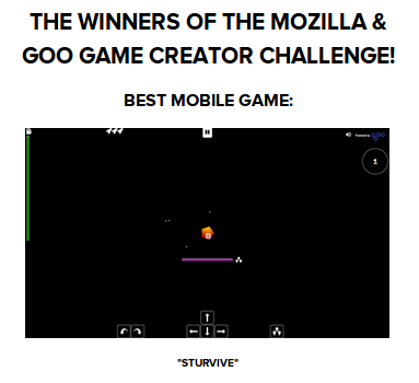
This article explains why Sturvive has such ugly graphics but also has good points.
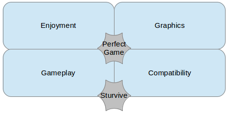
To me, a great game brings together gameplay and game pleasure, the pleasure is greater with immersive graphics. And the game must be playable by everyone.
When I heard about the goo challenge by mozilla, I wanted to discover the 3D world. But, with the deadline so near (1 month) I knew that I had to compromise.
The only point on which I never compromise is, of course, compatibility. Note, I am not saying that I have created an IE6 compatible 3d game.
No, for me being compatible, is to push the limits of what we can do with what we have. And, when it is not compatible, explaining to the user why he can not play.
How many times have I found websites where the page is white and empty ? How frustrating! To avoid this I have developed a compatibility page. It's very easy to create and all users know what to expect.
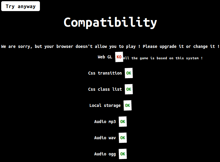
I have already created a similar page on a previous game, now I add one to all my projects, as well as to my professional projects.
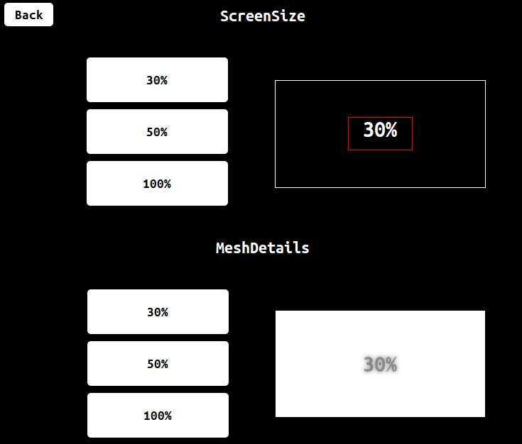
Next, compatibility must allow old computers to play the game. I have an old PC, well, old... it's relative of course. It is 3 years old, for me it's not old ! I am a developer, I am a lover of the lastest technologies, but I want my old computer, to be able to display a simple 3d game. If for that, I need to decrease the number of meshes or decrease the canvas size, no matter the ultimate goal is to play.
What's more frustrating than to have a beautiful but impossible to understand game ? With Sturvive, I didn't create a straight-forward enough game, so I have added descriptive help, unfortunately players don't read this...
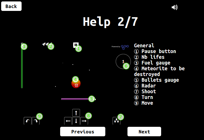
Knowing this, I created three training levels, the only thing missing is an in-game tutorial so that the player is guided throughout his progression, but I haven't had the time to do this.
Finally as there is more space on the desktop version I added some visual indicators. However if I had known that all screenshots would be taken from the desktop version I would never have added those indicators because they are so ugly...
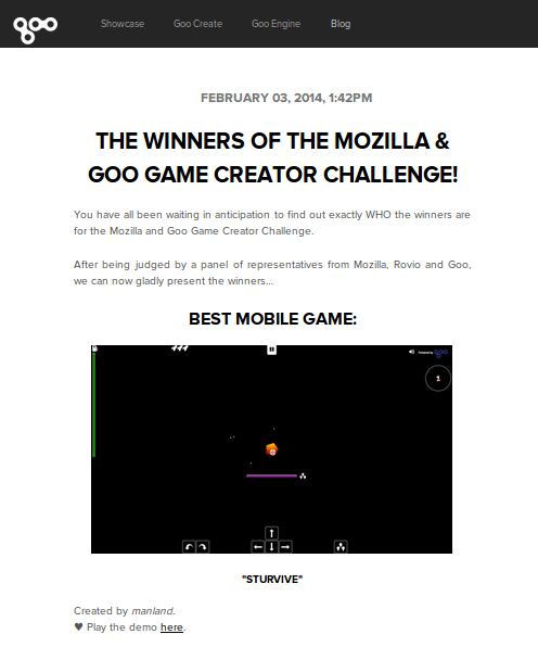
As I have tried to explain, discover the 3D world, the goo library : goo engine, web mobile development, wanting my game to be playable and understandable, all of that, in 1 month, (with Chrismas in between) did not allow me to take enough time for graphics.
In addition, i'm a developer with no artistic taste. If you ask me to choose between two colors, I will choose the ugly one.
The idea of the game ? I almost have no choice. Indeed, the space : some white spheres to simulate stars and bam! a universe is created. We added some orange spheres to have some meteorites, now we have to kill them and a game is built.
To add little challenges, we modify some variables and we have different kinds of levels. And bam! we have Sturvive.
To sum up, we have a compatible game, which explains the reason why a user can't play. Options to manage high quality visuals but also, allow simple hardware configuration to play. The game is translated in English and French. It's accessible by phone and desktop.
I can deploy a new version with one command, thanks to Grunt. All the JS is minified and the CSS is concatened in production to obtain a very short loading time.
The game has 4 kinds of levels, 18 levels and 6 starship improvements. All of that allows to play, on average, 20 minutes.
Since the end of the contest, I have developed the installation on Firefox OS. And I will have it, soon, for the Firefox OS market.
For the future ? I have no idea, if I have time I will create a multi-gamer version. What do you think about that ?
Thanks to GooTechnologie and Mozilla for organizing this contest and more generally for the work on WebGl.
My early testers Audrey, Laurent, Matthieu, Julien, Vivian, Adeline and all my collegues for their advice and encouragement.
And github who hosts the majority of my web creations like Sturvive.
Reviewers : Audrey, Sara